Thursday, April 17, 2014

Unstandardized Choropleth Map


http://www.economywatch.com/economies-in-top/?page=full

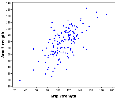
Unstandardized choropleth maps established a value and a pattern across space.  The establish value in the map above is GDP of the countries across the world.  The darker the blue the higher the GPD which means it has a stronger economy.  The white is the countries with the lowest GDP.

Bivariate Chorograph


http://my.ilstu.edu/~jrcarter/Geo204/Choro/

This is an example of a bivariate chorograph because the map above focuses on two variables and has the same spacial pattern over an area. The two variables are the men and women ratios across the United States.  This map is also broken down into five groups with different ratios all labeled with different shades of green or white.

Univariate Chorograph Map


http://hosting.soonet.ca/eliris/remotesensing/bl130lec7.html

This is an example of a univariate chorograph map because the this map focuses on one variable which is life expectancy in Africa and the Middle East and displays it in spacial pattern. The life expectancy is broken down into five subgroups and each is labeled with a specific color.

Nominal Area Choropleth Map


http://andrewgelman.com/2007/10/25/some_cool_graph/


Nominal area choropleth maps are created to provide nominal data over an area. 
Gender, occupation, ethnicity, race, are examples of nominal data because the order of the categories doesn't matter. The chart above shows the republican and democratic party of rich voters only.  This is nominal because the democratic and republican party have zero value.


Star Plots


http://what-when-how.com/statistics/skewness-to-systematic-review-statistics/

Star plots are a useful tool to compare multiple variables of one area to areas else where.  In a star plot the graph has a middle or focus point where the variables have an original starting position.  In the graph above four cities are compared to each other with the same 7 variables.  The shape of the star helps identify what variables are effected largely or hardly at all compared to the rest.

Correlation Matrix


https://support.sas.com/documentation/cdl/en/statug/63033/HTML/default/viewer.htm#statug_ods_sect017.htm

A correlation matrix describes the correlation between multiple random variables.  In the chart above is the standard procedures on how to rate automobiles.  All of the 10 variables effect one another and the data is then collected to come up with a over all ranking for the car.

Similarity Matrix


http://www.builtlean.com/2010/08/03/ideal-body-fat-percentage-chart/

Similarity Matrix's show the correlation between two variables and is then projected on a graph.  The image above shows the correlation of a individuals age and the four different body types lean, ideal, average, and above average.

Stem and Leaf Plot


http://www.eduplace.com/math/mhm/5/06a/

Stem and leaf plots are a great way to present a visual aid of large groups of calculated data.  The numbers are split between the stem and leaf to represent the actual number.  For example a stem 4 and a leaf 5 equals the whole number 45.

Box Plot


http://www.emeraldinsight.com/journals.htm?articleid=1881783

Box plots are a great tool to show statistical distribution.  The box plot visual is broken up into quartiles with a maximum and minimum data point.  The red box's on the chart above show the majority of the sample group and the line in the middle is the actual average or median of the data collected.  The lines coming from the red box are the maximum and minimum values of data collected.  In this study the girls tested slightly better than the boys in the math test.

Histogram


http://www.analyzemath.com/statistics/histogram.html

Histograms graph a distribution of statistical data but is more of an estimation tool or to find the probability because it focuses on the frequency amounts.  In the histogram above it shows the heights of 30 different people and breaks it down in to categories of centimeters.  The frequency is then plotted by falling into a category of height.  The heights of 30 new people will produce different results.

Parallel Coordinate Graph


https://www.eyebeam.org/taxonomy/term/5029

This is an example of a parallel coordinate graph of 50 cent, Jay-Z, Biggie, and Nas throughout their rap career.  Inside this graph there are multivariate data from each rapper and the X axis has no real value.

Triangular Plot


http://www.styrenemonomer.org/2.4.1.html

This is an example of a triangular plot graph.  The graph compares three variables inside a shape of a triangle to show the relationship with one another.  The image above compares different percents of volume of three different gases nitrogen, oxygen, and styrene.  The different amount of volume each gas has affects its properties.  For example oxygen and styrene can be flammable at certain volume percentages and also non-flammable.

Wind Rose


http://alternativeenergyatunc.wordpress.com/2010/03/16/wind-roses/

Windroses are a great visual tool for meteorologist to understand the distributions of the wind speeds and frequencies over a specific area.  The wind speeds are broken down into seven categories all being different colors representing certain wind speeds.  In the chart above the strongest winds come from the west and the south all under 20 mph.

Climograph


http://oldclimate.gi.alaska.edu/Climate/Climographs/ANC.html

Climographs are visual graphs that gather data from climatic parameters over a certain area.  The map above is a climograph of Anchorage, Alaska that collected data and averaged the monthly high and low temperatures and precipitation throughout the year.  The Month of August shows most extreme weather compared to the rest of the months. August received almost 3 inches of precipitation with a high of 63 degrees and a low of 50 degrees.

Population Profile


http://www.census.gov/2010census/

A population profile is a chart showing the population of an area through age and gender.  These charts are a great visual display to compare countries populations worldwide.  In the chart above the chart is split in two one side male and the other female.  Each bar consist of five years and depending on the age of someone they would fit into the graph.  The larger the bar is horizontally indicates the actual amount of people that age are living in that area being studied.  In this case Washington D.C. has roughly 38,000 females at the age from 25-30.

Scatterplot


http://davidmlane.com/hyperstat/A60659.html

Scatterplots show the relationship between two variables, one on the X axis and the other on the Y axis.  Each dot represents the data of the relationship between the two.  For example the graph above compares the relationship between arm strength and grip strength.  Each blue dot is the data of one test subject of the study.  Over a large group of participants the graph displays a strong relationship of arm strength and grip strength but isn't a perfect relationship.

Accumulative line Graph


Accumulative line graphs are used when they represent one item and using set of data presented over a period of time.  In this example it shows the amount of cumulative eruptions of old faithful and the durations it lasted.  The graph has a positive correlation with the cumulative eruptions and the duration of minutes.  It is a useful tool to track the progress of a certain item over time, especially in the business industry.

Bilateral Graph


http://seekingalpha.com/article/241440-will-octobers-improved-trade-deficit-continue

This is an example of a bilateral graph because the graph provides more than two sets of data.  The U.S. trade deficit with the world is broken down into billions of dollars spent, months of the year, and the overall projections of the years 2009 and 2010.  Using the map you can see the amount of billions of dollars fluctuate over the two year spans.  The graph provides a great visual to compare certain points over time. 

Classed Choropleth Map


https://www.msu.edu/~dougl126/lab4.html

This is an example of a classed choropleth map of breast cancer rates of white women in the United States.  In the image above is broken down into five classes determined by different colors and each color has its own statistical value.  The light yellow color represents the lowest level of cancer rates which ranges from 15.88-21.56 percent.  The majority of the southern states appear this color.  The highest cancer rates are the dark red colored states and that seems that cancer rates are highest in the New England region.

Range Graded Proportional Circle Map


http://pubs.usgs.gov/fs/fs-004-03/

Range Graded Proportional Circle maps are not continuous because the data is at a fixed point.  The size of the circle significantly correlates with the value of the data the map is illustrate.  This map is a map of Lewis and Clark's expedition across the United States.  The map above circle sizes indicates the size of the width of the canal.  The key shows rivers that is navigable by three options, boat, canoe and pirogues, or its not navigable at all.

Continuously Variable Proportional Circle Map


https://www.e-education.psu.edu/geog486/book/export/html/1796

Continuously variable proportion circle maps use circles to symbolize to represent a phenomenon in a specific region.  In this case the map above shows the motor vehicle deaths in the state of California.  According to the scale the greater the size of the circle the more deaths in that region and the smaller the circle the lower amount of fatalities there were.  The circles are not completely accurate but gives a good understanding the amount of motor vehicle deaths occurred in that area.

DOQQ


http://en.wikipedia.org/wiki/Digital_orthophoto_quadrangle

The image above is an example of a DOQQ map.  DOQQ stands for digital orthophoto quadrangle and this aligns the that latitude and longitude with the pixels in the image.  To create a accurate map and reliable.


DEM


http://ned.usgs.gov/historic.html

This is a picture of Mount St. Helen after it erupted in a DEM (Digital Elevation Models) format.  In this image above one can easily see the quick rise in elevation of the volcano along with the large crater that was left after the eruption.  It also provides a general understand of the land features that surround the volcano.  The image also clearly shows what the terrain is like around the side walls of the volcano.


DLG


https://www.e-education.psu.edu/natureofgeoinfo/c7_p7.html

DLG stands for Digital Line Graph.  The map above is a DLG in Pennsylvania that shows different transportation routes.  The map shows the terrain and elevation of the region which are labeled as the orange lines.  The red lines indicate land routes one can take like trails, roads, paths, and railroads. The blue lines mean flowing water of a river or a lake

DRG


https://www.e-education.psu.edu/natureofgeoinfo/c6_p6.html

This is an example of a DRG map. DRGs are scanned raster images of USGS  topographic maps that act a foundation.  In this map we can identify the rivers, lakes, streams, and land features of this region.

Isopleths


http://www.mdpi.com/1660-4601/5/3/165/htm

The image above is an example of a isopleths map.  It shows the amount of noise decibels (dB) during the day across a study hall in Asansol, India.  Throughout the day an average decibels of sound were recorded at specific locations.  The isopleths group the regions with the similar amount of decibels similar to isobars.  The map shows areas with the greatest amount of noise and areas with the least amount of noise that one should most likely chose to study at.

Isopach


http://pubs.usgs.gov/of/2003/ofr-03-037/htmltext/introduc.htm

This isopach map shows the thickness variation of a the rocks that contain shale across Illinois, Indiana.  The different colors indicate the type of stage the shale maturity is currently in so they know where to drill to extract it.  The red region is the area is very dense and concentrated and is currently ready for extraction for oil production.

Isohyets


http://traveloutbackaustralia.com/start-here/outback-climate-and-weather.html

Isohyets are lines that group regions in an area that have similar amounts of rainfall during that period of time.  The image above breaks down the entire country of Australia into colored sections depending on the amount of rainfall each region received that year.  The darker the shade of green indicates regions across Australia that experienced the heaviest amount of rainfall, mostly located on the northern and eastern coastline.  As the green shades become lighter on the map means there is a decrease in the amount of rainfall.  The white areas on the map show the least amount of rain fall which is the desert region in the middle of Australia.

Isotachs


http://www.erh.noaa.gov/btv/events/28Oct2008/ua2.php

Isotachs are similar to isobars but instead isotachs group areas of a region with similar or equal wind speeds.  The image above groups areas across the southwest of the United States into categories of the wind speed.  The graph shows the direction and speed the wind is traveling and where the jet streams are located.  The blue and purple colors on the map show areas with stronger wind speeds and the strength of the wind speed can be identified using the key on the bottom of the map.

Isobars


http://www.nc-climate.ncsu.edu/edu/k12/.IsobarIsotherm

Isobars are an extremely useful tool in meteorology.  They connect areas across a country with similar or with equal atmospheric pressure by outlining it with isobar lines.  In the image above you can easily identify regions that have high or low atmospheric with the labels L and H.  The image also shows areas that will have potential rain or snow fall.

LIDAR


http://www.loc.gov/exhibits/911/911-maps.html

The image above is an example of LIDAR mapping.  This LIDAR image shows the different levels elevation of the buildings of ground zero site in New York.  The 3d mapping was useful for fire rescue and emergency response units because the laser technology provides information like changes in the pile of rubble to make sure it was safe.  The color blue in the image has the highest elevation and as elevation drops the colors change to green, yellow, orange, to red being the ground floor.


Wednesday, April 16, 2014

Doppler Radar


http://www.noaanews.noaa.gov/stories/s2084.htm

The image above was taken by a Doppler Radar of hurricane Isabel in 2003.  The Doppler Radar imaging allows the breakdowns of the outer bands of the hurricane by showing the strength of  the maximum wind speed.  The image also predicts areas that would suffer from worse weather conditions such as heavy rain or even hail which is a useful tool for whomever is in the area.

Black and White Aerial Photo


http://stadiafile.com/tag/florida-state-seminoles/

The image above is a black a white aerial photo of Doak Stadium in the 1950's. In the picture the football field,bleachers, and parking lot are visible.  If you look close enough you can see the teams on the field.  Black and white photos are not the best at creating a crystal clear image compared to modern day color photos can.  Since this was taken in the 1950's much has changed and developed in this area.

Infrared Aerial Photo


The map shown above is a picture of Boot Cove in Corpus Christi Bay in a infrared aerial view from a satellite above earth.  The infrared captures different amounts of energy throughout the bay area.  It shows the different channels, sea grass, and land features.  The red areas are the areas that give off more radiation then the areas around it in a different color which seems to be mainly around the edges of the islands in the bay.
 

Cartographic Animations


http://9598946.sites.myregisteredsite.com/blog/national-news/studies-show-new-orleans-growth-since-hurricane-katrina/

This is an example of a cartogaphic animation of Hurricane Katrina's path in 2005.  The map shows a series of movements of the location of the eye of the hurricane over time.  The map also presents the wind speeds of the hurricane during several points of time by the use of colored rings and the strength of the category of the hurricane as it moved.

Statistical Map


http://www.floridahurricane.net/tropical-storm-fay.html

This is an example of a statistical map of the potential threat of cities in Florida being hit directly on by a hurricane.  The statistical information was gathered from previous hurricanes records in the past and potential influencing factors for future hurricanes to come.  Areas south of Palm Beach County and cities in the panhandle of Florida are at the highest risk of being a target of a hurricane.

Cartograms Map


http://www.worldpopulationatlas.org/

This is an example of a cartogram map.  Cartograms distort the distance, area, and shape of the continents to show the population size within the country relative to its size.  Since India, and China have the worlds highest populations, both of the countries are more than three times the size they actually are.  Areas with large amounts of land like the continent of South America decreases in size because of the lower levels of their population.

Flow Map


http://aerosociety.com/News/Insight-Blog/1644/ATM-a-vision-of-the-future

This is an example of a flow map of the world's future aviation path.  Each line on the image above indicates a route that the airplane will travel to reach its destination.  The color red in the map symbolizes that there is multiple routes in that area and are more frequently traveled compared to the yellow lines.  As globalization grows more flight paths will be created.

Isoline Maps


http://mavdisk.mnsu.edu/larsop2/geog101/Tools/Tools.html

This is a isoline map and it presents the surface temperature across the U.S. on September 28th, 2005.  This is an isoline map because lines group areas with the same value. For example Florida is mostly red between 80-85 degrees and the map indicates that other areas like parts of Texas, Louisiana, and Arizona have the same value (Temperature).  The farther north from the equator the cooler the temperature would be and most of the isolines are horizontal across the states.

Proportional Circle Map


http://personal.frostburg.edu/mtmaier0/maps.htm

The map above is shows the traffic fatalities in the U.S. by state in 2009 in a proportional circle projection.  The size of the circle in each state is significant because the size of the circle shows the amount of  traffic fatalities each state had rather than presenting it in numeric form across the state.  The size of the dots range from the smallest begin deaths recorded under a hundred  to the largest circle which is deaths in the thousands.  Proportional circle maps create an easier way to identify what the viewer needs to know.

Choropleth Map


http://hci.stanford.edu/jheer/files/zoo/

This is a Choropleth map of the percent of obesity in each states across the United States.  The different color shadings have a significant value to them.  As you can see using the key on the bottom left of the map that states with the color green shades indicate a lower percent of obese people and the state with the lowest obesity percent is the state of Colorado.  The darkest shade of red shows the states with the highest amount of obesity like the states of Mississippi and Alabama.  

Dot Distribution Map


http://depts.washington.edu/chinaciv/geo/people.htm

This is a dot distribution map of the population of china.  Each little dot indicates 50,000 people in that area and the darker the red means that area is a very densely populated.  From this map one can conclude that the majority of china's population lives near the east coast of the country to the heart of the country (middle).  The map also shows that from the middle of the China to its boarders in the west has extremely low population or almost none.

Propaganda Map


http://gregandchels.com/2012/03/war-propaganda/

This a propaganda map of the United States view point of confrontation with the middle east countries especially Iran.  The maps purpose is to show the strength and dominance of the United States and if things escalated between the U.S. and Iran, Iran would simply be destroyed by the United States because the country is surrounded by 45 U.S. military bases that are represented in the map by a black dot. The map can also strike a fear into citizens of Iran because the country is surrounded by a foreign military bases.

Hypsometric Maps


http://www.reliefshading.com/colors/hypsometric.html

The image above is a picture of the Aegean Sea.  The map uses different shades of colors to show the relief (elevation) of the earths crust above and below sea level.  The colors only represent the relief of the land, for example the different shades of blue doesn't indicate warmer or cool water but instead how depth of certain areas in the Aegean sea.  The greenish/turquoise shades of color show the shelf of the shoreline surrounding the land that protrudes from the ocean.  The visible land in the map shows the terrain by using different shades of the color brown

PLSS Maps


http://www.rootsweb.ancestry.com/~alfrankl/landrecords.htm

This map above is a example of Public Land Survey System (PLSS) map of Franklin County, Alabama.  The entire county of Franklin was surveyed and then broken down into rectangular subsections for the public to purchase property.  The red lines in the image above indicate the separation of the subsections and the blue shows the different townships in the county.

Cadastral Map


The image above is a cadastral map which is extremely useful for property owners so they know what part of the land is theirs.  The map shows the shape and the size of the property of land the landowner owns.  Properties across the world are broken down through a measurement of metes and bounds of that areas specific county.  In the map above each property is labeled with a number so the piece of land can be identified.  The map also provides the shapes of property and the different streets that divide up the area.   


Thematic Map


http://www.gigawiz.com/thematic.html

Thematic Maps purpose is to show a general theme of something and project it over a certain area. This is an example of a thematic map over the United States in which illustrates the different states that the Republican Party or the Democratic Party had the majority in January 2007.  As shown in the key in the lower section of the map the red colored states indicates that the Republican Party were the majority leaders at that point of time in January and the blue state are the Democratic Party.  There are over 26 states that are in favor for the Republican Party which means the Republican Party was leading as of January in 2007. 

Topographic Map


http://mail.colonial.net/~hkaiter/topographic_maps.html

Topographic maps show the shape of the earths crust in a 3 dimensional picture because the earth is not perfectly flat.  The image of the map above shows in great detail the shape and relief (elevation) of the land feature.  Each ring (contour line) indicates a change in relief and certain rings are labeled with the height of the elevation so the viewer of the map can get a general knowledge of the change in relief in a certain area.  It is a useful tool for areas of the planet with abstract terrain.

Planimetric Map


Planimetric Map


http://www.tripleblaze.com/blog/2013/03/27/navigation-basics-types-of-maps/

This image above is an example of a planimetic map.  Planimetric maps are created in a  very simple manner are made and show the area of a location in a horizonal layout.  This map portrays the different types of trails, paths, roads, rivers, and other natural features in this region.  It is a extremely useful tool for campers, hikers, or anyone in the outdoor around this area and it doesn't require much experience to understand because of how simplistic the map is.     

Tuesday, January 21, 2014

Mental Map


http://lacamina.blogspot.com/2008/09/mental-map.html


This picture is of a mental map of an average college student.  The map is portraying a world wide view of the earth.  As you can see this map is not a reliable source for accurate information.  The distances between places on the map and shapes are all just mental guesses of a student who is not to familiar with geography.  The countries that are labled are all accurate but very few are listed.