http://davidmlane.com/hyperstat/A60659.html
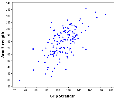
Scatterplots show the relationship between two variables, one on the X axis and the other on the Y axis. Each dot represents the data of the relationship between the two. For example the graph above compares the relationship between arm strength and grip strength. Each blue dot is the data of one test subject of the study. Over a large group of participants the graph displays a strong relationship of arm strength and grip strength but isn't a perfect relationship.
No comments:
Post a Comment